PROJECTS
The following projects are a small sampling of assignments from my college courses taken in 2023. For each project, I’ve described the objective as well as some of my thought processes. These projects were very different than any of the Industrial B2B design work I’ve done throughout my career. Finding myself so far out of my comfort zone was challenging, frustrating at times, yet very rewarding in seeing what I was capable of designing. I had some tough Professors, but I’m forever grateful for their abundance of knowledge & guidance in helping me elevate my skills.
MUSIC GENRE STAMPS
OBJECTIVE: Choose four musical genres from a given list. Create one visually representative stamp for each of the four genres. The stamps should be cohesive in a way that they look like a set, yet each are strong enough to stand on their own.
I chose Rock, Punk, Disco, and Country.
FINAL RESULT & HIGHLIGHTS: For each genre I created custom vector graphics in Illustrator of the guitars and bass for easy scaling. Each of the instrument’s stylings are representative of their genre and speak volumes of their music type. All four show energetic crowd silhouettes (stock graphics for timing purposes). The biggest challenge for me was Disco. The other three had many similarities, but Disco is about the rhythm and dance, so I had to factor that into my design.
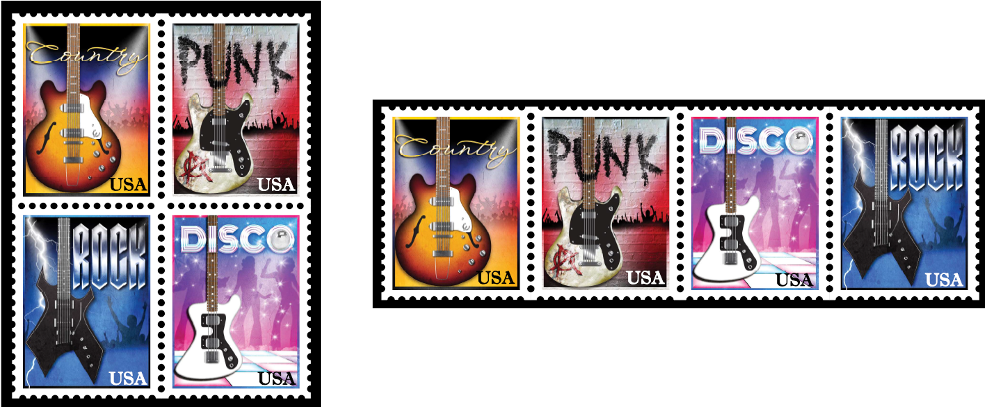
COUNTRY: Sunset gradient colors (as in riding off into the sunset), clean script typography graphically manipulated to mimic gold, stock graphic of energetic crowd silhouette with some wearing cowboy hats, blended in concrete texture, and reversed sunset gradient color border.
PUNK: Red/black/white gradient colors, blended in wall texture, graffiti typography on the wall and guitar is added using displacement mapping in Photoshop to make it look more realistically applied to the environments, custom graphic created of the anarchy symbol, dirt & abrasions blended and painted on in Photoshop, and reversed gradient color border.
DISCO: Pink/purple/cyan gradient colors, blended concrete texture, custom dance floor graphic, Photoshop brush sparkles, metallic color and shine graphics applied to the typography, stock image of disco ball, stock dance silhouettes, and reversed gradient color border.
ROCK: Dark blue & black gradient colors, blended concrete texture, Photoshop lightning rod brush in several layers for intensity, Photoshop extrusion of typography with metallic gradients, stock energetic crowd silhouette, and reversed gradient color border.
BROCHURE PROTOTYPE

NON-PROFIT BROCHURE PROTOTYPE
OBJECTIVE: Search online for a local non-profit organization that you like. Using information from the organization’s website, create a prototype brochure that will be physically printed. The only thing you cannot change is their logo and color palette (if they have them).
I chose Horse Play Rescue & Sanctuary for my project prototype. Though they had a logo, they did not have a color palette.
I set several goals for this project:
- Had to be printed on 8.5 x 11 paper (the basic size that most offices have to cut down on out-sourcing print costs for the client).
- Interactive for the reader (used a “Traveling Snake Fold” which unravels their story).
- The fold also allows for inserting additional cards to advertise events without falling out.
- Size when folded needs to be small (easy to put into a user’s purse or pocket).
- Small enough to be mailed (sender’s address in print with blank area to apply mailing address). Gives the client the option to use as a mailer or handout at events.
FINAL RESULT & HIGHLIGHTS:
- Custom QR code that takes the user directly to their donations page of their website.
- Used their horse photos, brought them into Photoshop to increase contrast and turn them black and white.
- Chose compatible hues of purple and red to represent both Serious and Fun.
- Searched for and used three different typography styles that worked together, (serif, sans-serif, and script). The three together stacked and overlapped made for a nice word graphic.
- Stock horse silhouette graphics showing progress stages from a sick horse to a rearing horse on the cover.
- Stock graphics of horseshoes blended into the background.
- Their site had the names of the horses, so I made sure to add them which adds another element of personality.
TEA BOX PROTOTYPE
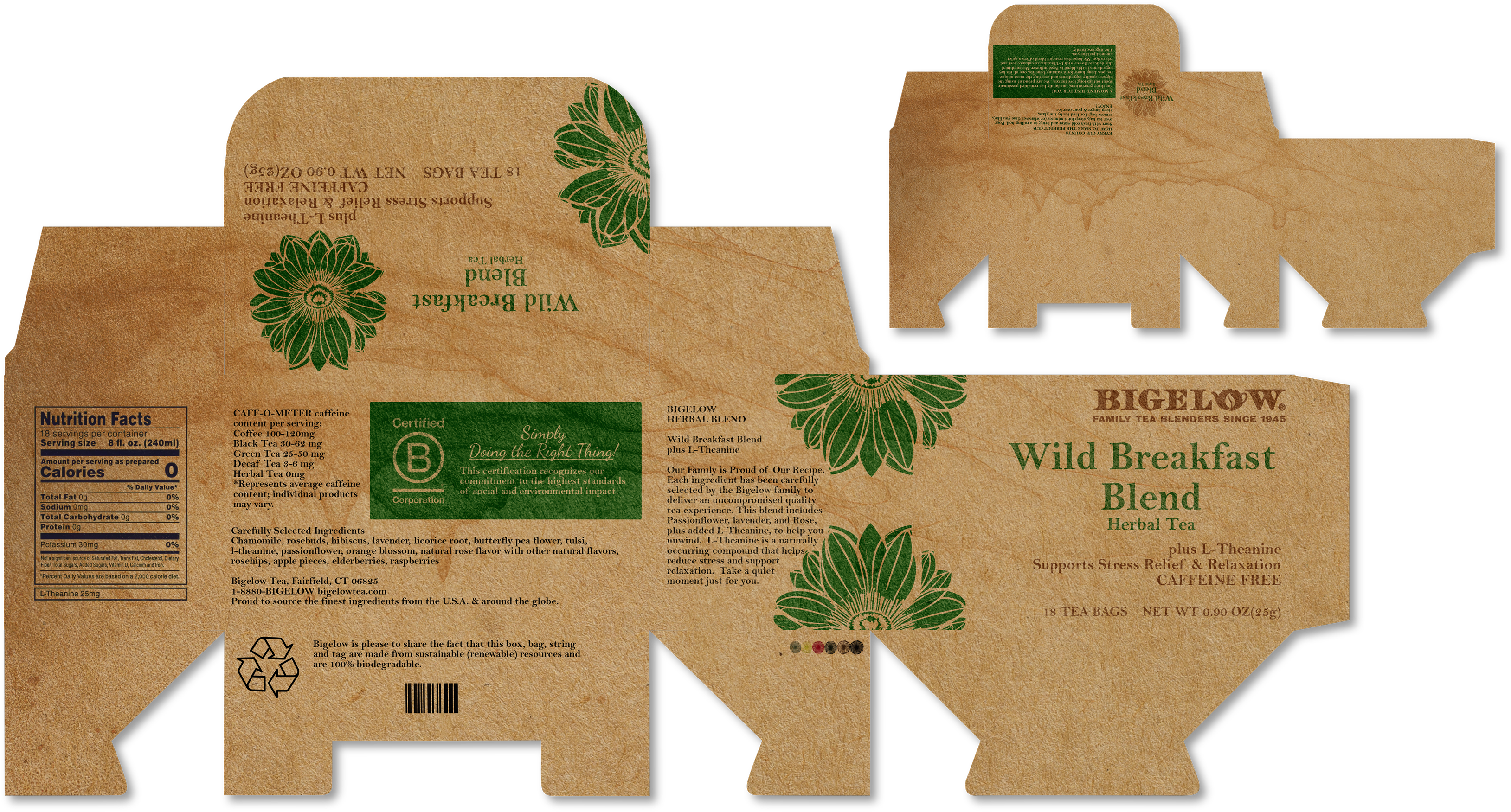
TEA BOX PROTOTYPE
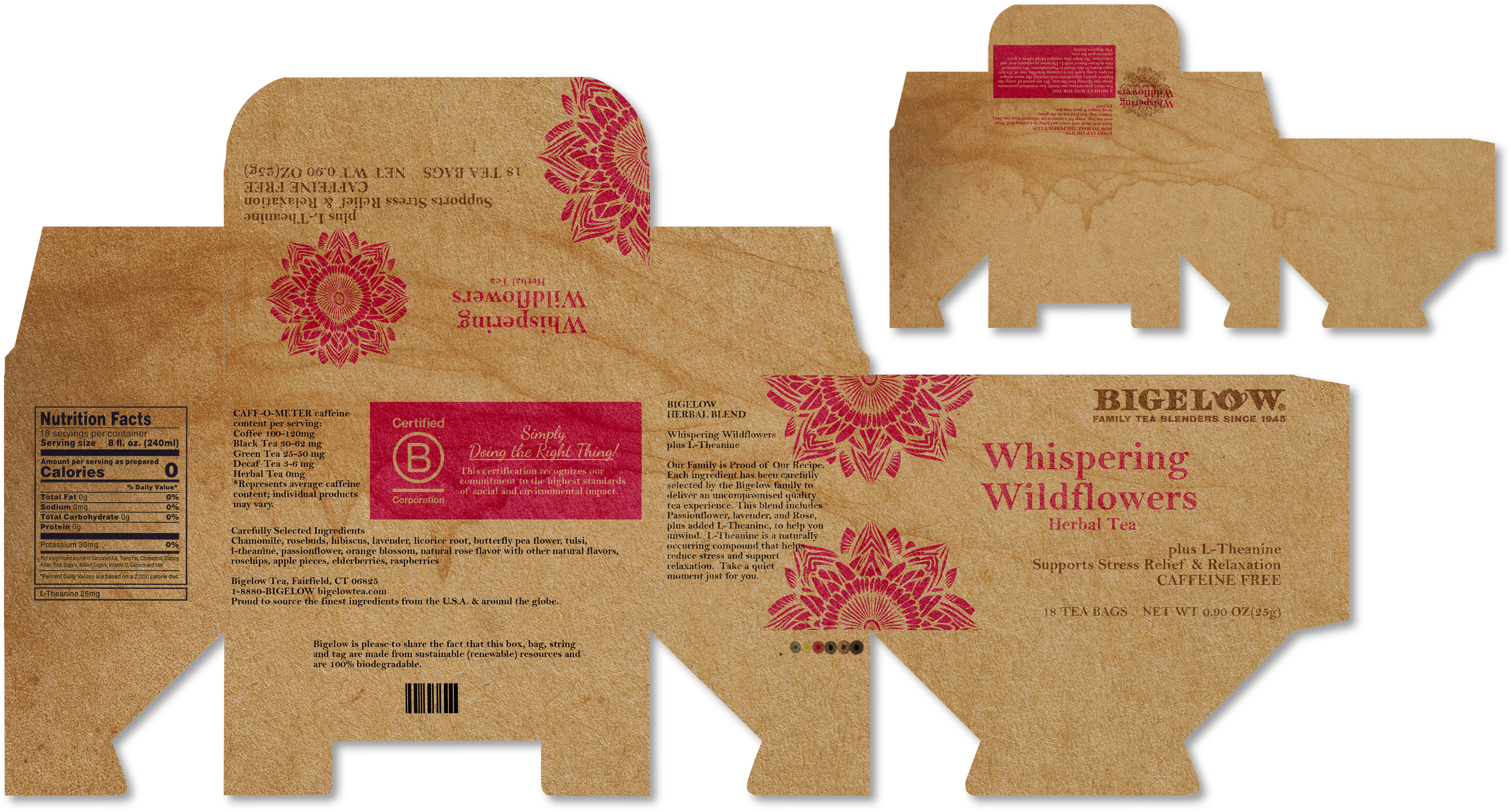
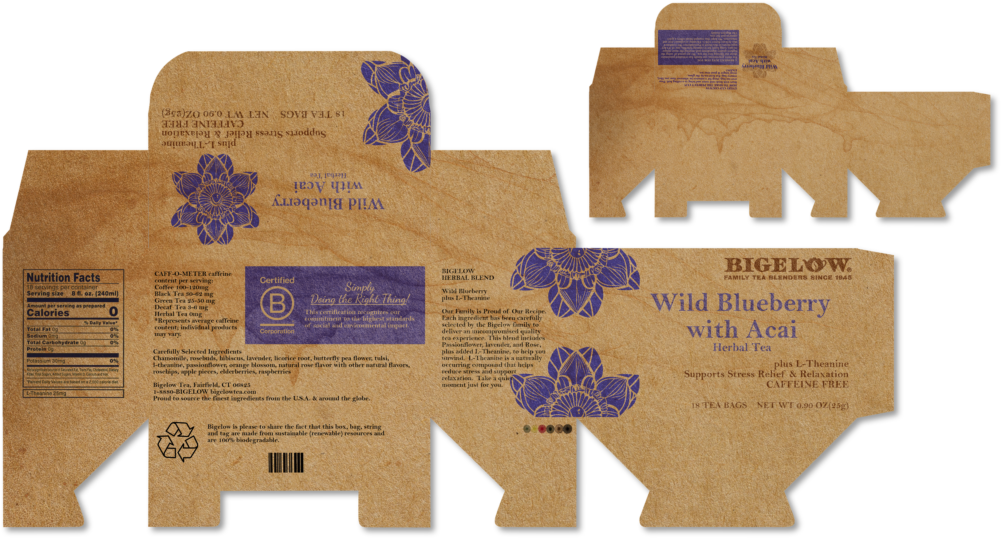
OBJECTIVE: Bring a tea box into class from your home. Whatever brand you brought in, you now had to use that brand and create a whole new look/design/prototype for their product boxes. All labeling and text information “has to be present” in your design. Create three different looks of your design.
I had brought in a box of Bigelow tea, therefore I had to create a whole new look & design for Bigelow. This was a BIG challenge because my research on their boxes at every angle showed that every inch of their boxes had text, decoration and photos and very colorful. But I challenged myself further by deciding to go minimalist!
Through my research I’d also found out that the Bigelow company is very proud of their sustainability efforts. I’d contacted a friend in the recycling business and asked about inks and papers and drew some “possible” conclusions from the information. Many recycled papers containing inks result in brown, black, or grey which can be tough to re-sell. My thought was, why not use recycled brown cardboard to create a market for it, with minimal ink colors in the design which may help to create a circular economy.
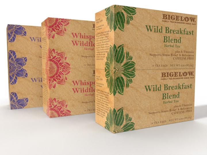
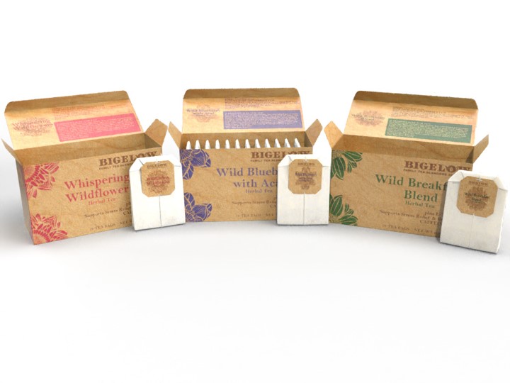
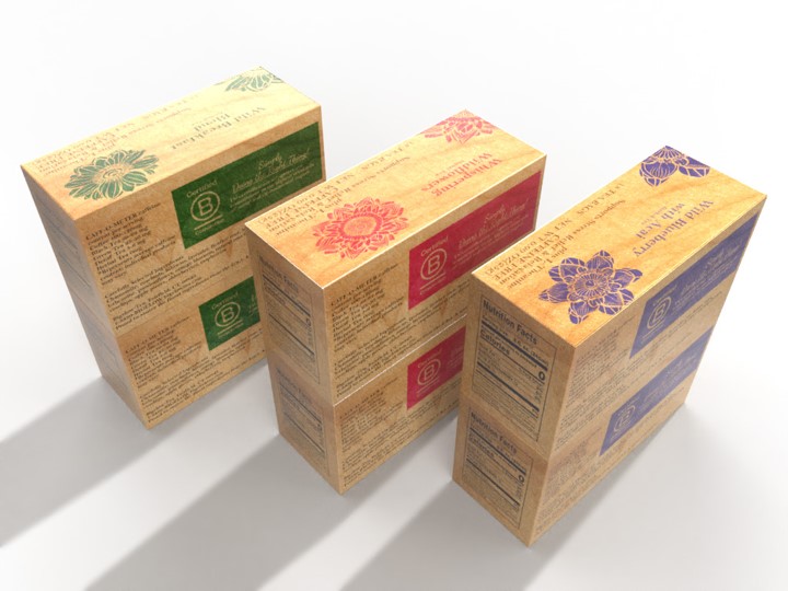
FINAL RESULT & HIGHLIGHTS:
- Each design has four colors: one accent color, one text color, tea-staining, and the brown Bigelow logo color.
- Floral-like cut-out graphics (AI created in Illustrator, then I had to clean it up. We were allowed to try AI, but had to specify everything we used AI for. It was my first attempt at AI and found it useful yet still a lot of work to turn it into what I was looking for).
- Tea staining texture photo blended into the background.
- Placement of the floral-like graphics allowed for decorative stacking which can be eye-catching in a store.
- The end result after taking away much of the panel-to-panel colors and decoration gave it that minimalist look I was going for.
Additional Thoughts: This approach would cost Bigelow a little bit more for their packaging, and the cost would probably be handed down to the consumer. However, the several more cents might not have a negative affect on consumers knowing that 1) Bigelow tea in itself is a quality product and 2) working towards a circular economy would greatly help towards the future of our planet, which in my opinion is worth the several cents investment.
